Earlier this year, Vice President Biden gave me a homework assignment in his dining room. He asked me, along with a few other data and analytics industry folks, to join…
One year from today, everyone living in the United States will be asked to respond to the decennial Census, our once-in-a-decade chance to do our civic duty. The Census is used for political reapportionment and redistricting, Federal funding allocation, business decisions, and so much more. Many cities, counties, and states are rightly concerned that the 2020 enumeration will miss more people than prior Census efforts. To better understand who is likely to be missed, and start building a plan to effectively reach them, state and local governments should leverage data-driven tools to explore their populations.
To this end, Civis created a Hard-to-Count Segment Mapping Dashboard, part of our suite of tools for states and localities to better reach their populations for the 2020 Census. Today we focus on Texas, but in the coming weeks and months, we will share tools for the entire United States, with a focus on how to best locate, understand, reach, and communicate with local populations.
How do you use the tool?
The Hard-to-Count Segment Mapping Dashboard is an interactive map that highlights Low Response Scores (the likelihood of non-response, where a higher number means less likely to respond), as well as demographic information about the population in each small area of geography. These areas are known as block groups, and they are the smallest level of geography released by the Census Bureau. You can filter the focus of the map on one of the several well-known hard-to-count groups, such as areas with higher percentages of children under five, higher percentages of renters, or higher numbers of Latinos.
After selecting a specific population, you can zoom in on your area of interest and select a block group for more information. Let’s dig in to better understand how this map can be a useful first step in any outreach campaign for the 2020 Census.
Examining the map’s benefits by using two hard-to-count communities as an example
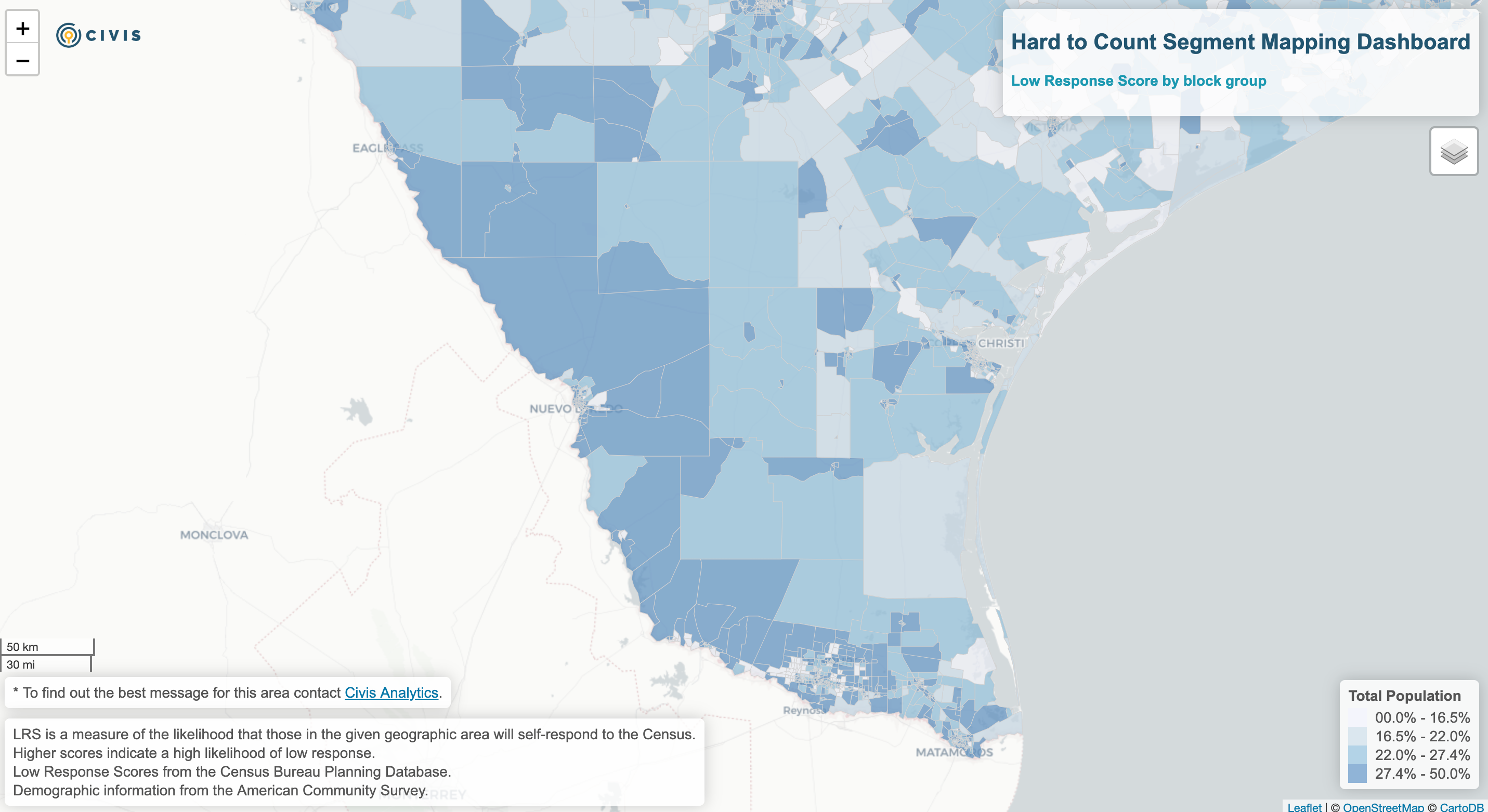
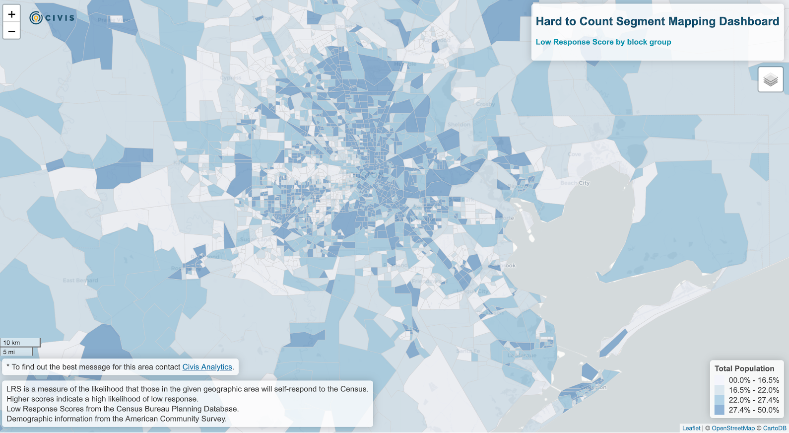
Today we‘ll look at two different areas in Texas: the border area from the Rio Grande Valley to Nuevo Laredo, and the Houston metro area, which are good comparison points for different types of hard-to-count communities. The border area from Rio Grande Valley to Nuevo Laredo is roughly seven times larger than the Houston metro area, but with a population of less than a third of the latter. The Houston metro area is one of the largest and most diverse in the United States. Both have a high number of hard-to-count areas, but for different reasons.
Overall Low Response Likelihood
Let’s start by looking at the overall low response likelihood. As we can see below, both areas have a high concentration of low response, with darker blues showing us a higher likelihood for non-response.
Border Area:

Houston Metro Area:

If we dig in more, we can see this likelihood for low response is driven by different factors.
This tool provides state and local governments with a first step in understanding easy-to-count, hard-to-count, and hardest-to-count populations. However, this is only the first step. In upcoming weeks, Civis will share tools to understand, reach, and respond to the populations identified, to increase self-response to the 2020 Census. If you are interested in talking more about 2020 Census response in your community, reach out to us, we’d love to chat.